
Buildom is mobile ready, and that changed everything
About two months ago I started a game project with a simple rule: no phone support until the game is worth playing. Because a mobile port is not a checkbox. It is a redesign of almost everything. The world touch, the button sizes, the panel layouts, the camera. Waste time on that before you even know if the game loop works, and you waste the best energy on the wrong problem.
The game loop works now. So I sat down and did the port.
What mobile means for a pixel game
Buildom is a keyboard and mouse game at heart. WASD, mouse wheel to zoom, click to mine, drag to build, number keys for toolbar slots. On a phone none of that exists. You have a touch screen, two thumbs, and whatever the browser gives you for virtual keyboard, which is nothing useful.
The touch controls existed before, but they were experimental. On this pass I reworked them properly.
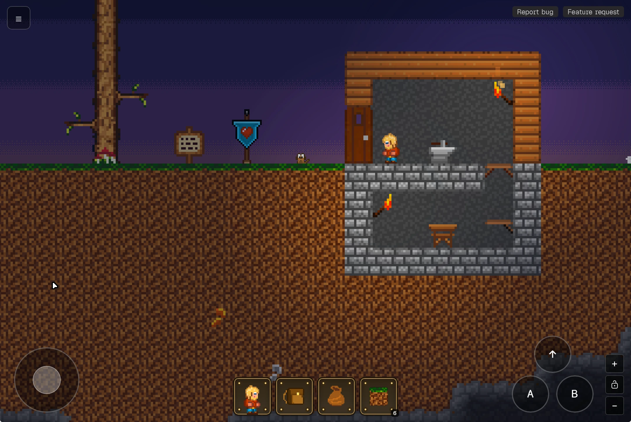
The joystick button layout got rearranged: the A (primary action) and B (secondary) buttons now sit in a row with jump centered above them, and the layout has separate portrait and landscape presets. The menu button moved from top-right to top-left so you do not hit it by accident while touching the right side of the screen. The joystick knob rendering got fixed too: the old calc(-50%) trick did not compose with the transform during drag, so the knob jumped. Now it uses -ml-6 -mt-6 instead. Simple change, took embarrassingly long to find.
Portrait camera
The biggest change was the camera on first load. On desktop the game centers on the world, and you scroll or zoom to find your character. That is fine with a mouse. On a phone, loading into an empty world view while your character is somewhere off-screen is a terrible first impression.
So I changed it: on portrait screens the camera now centers directly on the player on first frame, and hard-locks the deadzones so the player stays centered while moving. Landscape still works the old way, but mobile portrait is a completely different experience. You load the game and there you are.
Panels that fit
The build panel, the bags panel and the inventory all got responsive layouts. The build panel now shows block categories as a horizontal scrollable row, with a two-column block grid underneath. The bags panel wraps its items properly instead of overflowing. These are small things, the kind of things you do not notice when they work but that break the whole screen when they do not.
One more while I was in there
The lightning system got split into two render layers: background (sheet lightning that lights only the sky) and foreground (flash that lights the whole scene), controlled by config flags. That is not strictly mobile work, but it was the kind of small refactor that lives in the same branch because you are already touching the render stack for viewport tweaks.
What this means
Buildom now works on a phone. Properly. Mining, building, fighting, inventory management, all of it through two thumbs and an on-screen joystick. I have been testing it in the passenger seat on the way to work, and watching a game you built run in your pocket is a weird, good feeling.
Next up: the things that mobile still cannot do well. Precise block placement, quick toolbar swaps under pressure, typing for world names. Those will need their own solutions, and they will arrive whenever they bother me enough. For now, the game fits in my pocket, and that alone is worth the redesign.
Follow along here if you want to see how the mobile experience evolves.