
A character panel with a view
I think this might be my favorite update so far. The HUD was functional before: panels open, show their stuff, close again. But they sat where the layout put them, and the character screen was basically a doll with some slot icons around it. Both of those things bugged me, so this round became all about making the HUD feel like part of the game instead of a website floating on top of it.
The character panel went full canvas
The centerpiece is the new character panel, and the part I am genuinely proud of: the doll no longer stands on a flat color background. It stands in a little cave scene that is rendered entirely on its own canvas, using the exact same code paths as the real world. The floor tiles come from the packed block atlas with the same autotiling the world renderer uses, the backdrop is the actual cave wall tile, and two wall torches flicker on both sides using the torch animation frames from the world renderer too.
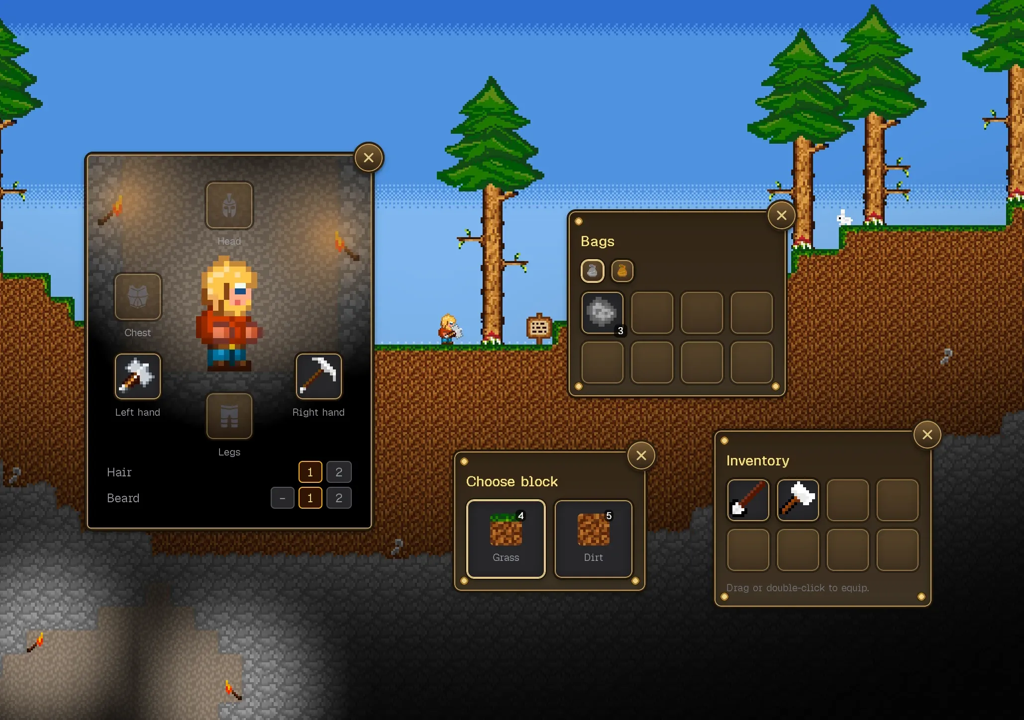
And it does not stop at looks. The scene also runs the game’s fog of war with a torch glow lifting the darkness, and the character’s own light aura around them. So the doll sits in a warm pool of torchlight in an otherwise dark cave, exactly like the player does in the world. The best part: the whole scene is one declarative config. Character position, free tiles left and right, headroom, floor and wall block types, torch positions, scale. If I ever want the character to stand in a dirt tunnel instead of a stone cave, that is a config change, not new rendering code.
The panel itself went MMO style: doll in the middle, head, chest and legs slots above and below, hands left and right. Equipment you drag in actually shows up on the doll, because the doll is drawn from the same sprite layer stack as the in-world character. Hair and beard variants get little selector buttons too, so you can fiddle with your look without touching the editor.
Panels you can throw around
The second big piece is dragging. Every HUD panel now has its title bar as a drag handle. Grab it, tear it off its docked slot, and it becomes a floating window you can put anywhere on screen. Let go inside the dock zone and it snaps back into place. Double-click the header to dock it again. It is the kind of interaction players expect from any UI these days, but wiring it up for canvas game panels took more care than I expected.
The fiddly part was remembering where a panel lives. While you drag, the position is a simple left/top coordinate. But once you drop it, I anchor it to whichever screen edge it was dropped near. A panel dragged to the right half of the screen saves its distance from the right edge, not the left. That sounds like a detail, but it is the difference between panels staying put and panels wandering around when you resize the window or play at a different resolution. Clamping keeps everything from being dragged half off-screen, with a minimum of the title bar always reachable.
Why this matters more than it looks
A HUD in a game is the part players touch every single second, and it sets the tone before anything else does. Panels that behave like real windows, a character screen that looks like it belongs to the same world as the caves, these are the details that make Buildom feel like a game and not a demo. Also, honestly, dragging your inventory to the far right corner because you feel like it is just fun.
Next I want to give the same treatment to the remaining screens and maybe let the panel layout persist properly between sessions. For now I keep opening and closing the character panel just to watch the torches flicker. If you want to see the HUD grow up one step at a time, follow along.